Involve placement - project worked on: pitch for Sage
Monday:
Firstly I was given the task to read through Sage's brand guidelines and get a feel for what the brands about and what they do. I made notes whilst reading through understanding there brand attitude as well as there design specifications. They'd recently had a massive rebrand so it was really important to understand what they wanted to communicate as a brand.
- just enough is more
- modern/alive/beautiful
- reduction
- most valuable supported of small/medium companies - greater freedom to succeed
- trust - safe & secure - control
- clean/inviting/contemporary
tone - confident, focused, accessible
consistency
simplicity/agility/innovation/trust/integrity
1) focus the business
2) capture tech opportunity - customers need and expect
3) benefits of subscription
flexible/affordable/higher value
adding pricing model
strengths - customers & markets
our people
our ecosystem
software & support
The Brief:
We were then briefed on the brief Sage had provided us by the project director and creative director.
Sage - more brand led company rather than just a product
builds business confidence - inner confidence in employees
They wanted a concept system to engage and reach there employees in order to gain 6% by the end of 2015.
Previous to this the managing and creative directors had come up with 3 concepts to work with for the pitch and ideas they'd had of how it could work.
Idea 1:
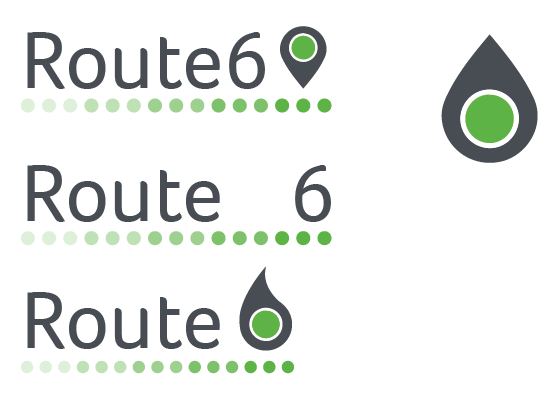
Journey to 6%
Title: Route 6
customers on journey to confidence
employees on journey to 6%
show engagement and contribution
travel
Idea 2:
customers - everyday heros
focus on small/medium companies
Behind every hoe - theres sage
Über employees - green blood
emotional - proud for working for sage
GREEN TEAM
family tree - modern twist
good badge of honour?
pop up shops - external customers
Idea 3:
inner confidence is..
coaching led campaign - let them discover themselves
whats the employees 6% goals?
trivial pursuit style pie pieces
Me and the junior designer were then sent away to find visuals for each concept.
I brainstormed each concept using linking words and sketches as I went on in my research.
Idea 1:
Idea 2:
Visuals for idea 2:
Idea 3:
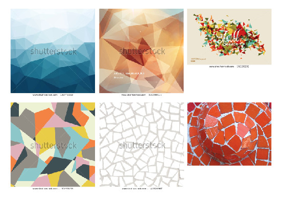
Visuals for Idea 3:
Me, the junior designer and the creative director sat down at the end of the day. We went through what we'd sourced through the day explaining our thinking in which he fed back on. From this he then defined the direction for each concept that he wanted us to take tomorrow.
Tuesday:
First thing in the morning we collected again but with the managing director also and ran through the visuals we'd resourced and the ideas we'd had. From this ideas were picked out and images stared which they liked the atheistic of.
From this I was then set to do designs for the threes concepts now they had been defined. My system for doing this was to approach each one by one. I did sketches initially from the visuals I collected as well as expanding upon this now with the defined direction. I then digitally created my sketches experimenting with colour and layout.
At the end of the day we had a meeting where we presented our initial designs. We then got fed back on what they liked/didn't like. At this point we were made aware that concept 1, route 6, would no longer be continued with as they had a conference call with Sage briefing outlining there three ideas and were informed that route 6 was a method they've seen previously. Therefore now the focus was on the other two ideas for the pitch. They picked out several elements of mine which they liked for the identities of the concepts as well other elements within them.
I was very pleased with the amount of work I had produced during the day and really enjoyed getting feedback throughout the process at different stages. This I felt encouraged me in my work and gave me a clear direction in what they were after.
Wednesday:
I was set to develop the ideas that were singled out the previous day.
I also did loads of design development on the behind every hero idea using the photography from sages brand portfolio. However I misplaced the file when sending them across at the end of my placement.
These were overseen midday by the creative director who then fed back and focussed the direction even more suggesting what he wanted me to now try with them.
I was also set the task of sourcing some images for mock ups such as mac screens, employees in the work space etc. for the designs to then be applied to.
Once I had done this I was given the task of creating a digram under Sage's branding whilst also applying the ideas we would be pitching.
I used Sage's typeface, colours and dotted line to apply there branding but then used the concept of the 6 ball from one of concepts to split it up. As alternatives I also created flow diagrams:
During one of the meetings they had discussed coming up with a way to show how the ideas work across all the different language as the company is global. I had thought of one way so I did a quick mock up of it to show David. He then encouraged me to try more variations.
I also developed the design for behind every hero after David had looked at my initial development and experimentation.
Today started off with a meeting with an overview of the current progress. Here we gathered and discussed where everyone was up to in creating the pitch presentation. We were set assigned jobs here on aspects of the presentation we were to work on. The junior designer was the person creating the document and laying out all the information. I was given different elements of the presentation which would be dropped in to what she was doing such as diagrams and icons.
The original diagram of Sage
The diagram redone with the new atheistic we were using. I did several variations of colours and layout so that David had several to select from.
I was also given the task of changing one of Involves diagrams. This meant working to the branding instead of Sages.
I was provided with there colour palette and current icon library so I could get a feel for there branding. They said I could use element from any of the pre made icons if I wanted. They told me to create new icons for this pyramid diagram.
This is what I created (with a few amendments by the creative director):
They also had a brand motto that need restyling for themselves. Involvement + firepower = outrageous effectiveness. I then did various experimentations with layouts and typefaces to create a strong visual for this. I used the involve typeface for the first section (which I don't have in my font book so it's not visible on my computer) and then, as directed by David, I selected/created typefaces that created a tone of voice for 'outrageous effectiveness'.
Friday:
Again we had a meeting on the pitch presentation progress and discussed what jobs now needed to be done by the team to get the pitch completed.
My first job was to source images for involves pitch board of there system: involvement, engagement, participation, collaboration.
I had the idea of these being hand gestures, each one would have a hand gesture to represent it rather than an image of people doing things. Therefore I sourced images of being with thumbs up, hands in, shaking hand etc. They really liked this idea and so I was directed to print out the selected ones for each and show the project director. He then approved and showed the managing director for final approval.
I then had to create more icons for Involve. There were five things they need icons for, they had previously discussed what they wanted these icons to be of so I received the list of the word and description and following the icon library I generated my own.
This I developed into these which I then passed onto the junior designer to decide on and place into the pitch document.
The senior designer then asked me to create a publication spread using the designs I had done for behind every hero so he could then use it as a mock up. I created two spread examples of the design being used.
As the Sage pitch presentation was approaching completion I was given tasks to do on another project they were doing which meant sourcing images.
Overall I had a really pleasant week at Involve and felt very much part of the team. I felt respected as a designer rather than a student and was encouraged by there feedback throughout the process. During the end of the week I had little meetings with various aspects of the whole team from marketing to digital so I could get a feel for all the aspects that go into projects. I feel I learnt a lot about the real industry from working within it and luckily it didn't feel to dissimilar to how we've been taught to approach briefs over the course. I really liked working as part of a group rather than alone and offering elements for all different parts of the pitch as well as different stages. It was really useful to also see it from beginning to pretty much the end and this benefited me because it meant I experienced the whole process except the actual pitch.
I think its made me feel much more confident in my abilities as a thinker, designer and general person. I lived in London, a foreign land to me, for a week with little to no problems. I was able to think of numerous ideas within a short period of time and generate a good quantity of work in a short period of time which I felt had started to lack recently at uni. It was encouraging to be able to keep up with the workload as well as request for more as i'd completed tasks. Its made me feel more prepared for the industry after uni now that i've experienced it and it isn't as daunting now knowing I am capable.
I learnt many things over the week such as the varying job roles and responsibilities, the system in which projects are broken down and the communication between the team through meetings, emails and shared computer network. I also learnt things about computer files, other departments involved in the pitching process, cheats for mocking up and the client relationship.


No comments:
Post a Comment