Visual Research
Design Development:
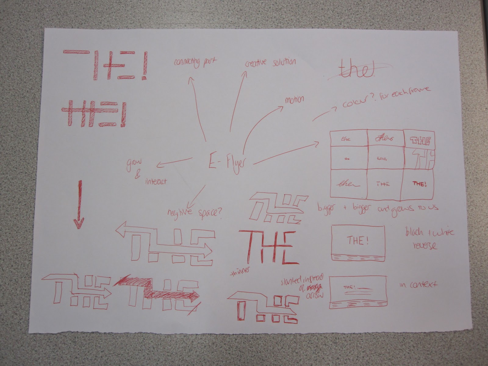
We wanted the logo to really represent us as a company and get the concept of us across
We thought of going big and bold and making connections like our actual name (the word 'the' being a connecting word)
We wanted it to look sleek and professional
One idea we had was to create a path that connected the three letters, the arrow being the direction of process and movement of brands as well as actual movement through a space as our focus was experiential design.
I came up with the idea of doing a moving clip where the word 'the' would go through different typefaces and end on ours. We considered doing different colours and white text but then decided to keep it simple and a created a colour scheme of black and white as we wanted to be bold and professional looking rather than kooky.
We discussed it going from small to big until it got to our logo. However we decided to keep all the typefaces the same and then end with our mission statement of what we do after our logo appeared.

These are some digital developments of the initial idea. We struggled to get it working with it being legible and the concept coming through.
We got rid of the arrow and just kept the flow of the line.
This was are final eflyer:


