

I really like the simplicity yet the effectiveness of the curved edge of this jewellery packaging. It's only subtle yet makes a huge difference to just a rectangular strip.

This is very striking use of black and white but extremely minimal. The stock speaks more than the design as there is barely any used.

I noticed this in a supermarket and I thought it was quite clever how the distribution packaging was designed as when stocked next to each other it would create the face and logo. Even when still in its boxes to make it more easy to shelf stack it creates a brand identity.

I love the detail and visual execution of this idea. Using elements of nature it brings softness to the form of insects.
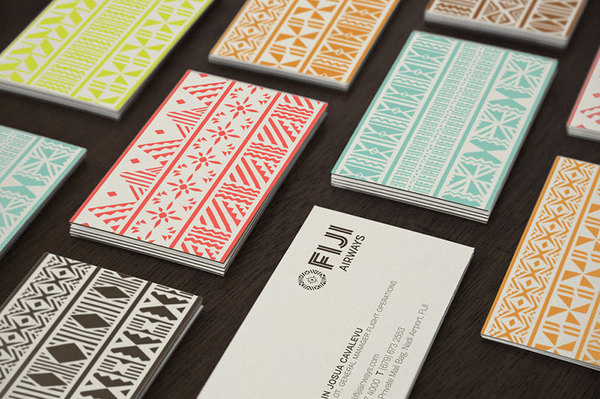
I really like the use of pattern and colour on the back of these business cards for FIGI Airways. It's not the usual identity for an airline but I think it works well representing the culture as well as looking good.


I found these kitchen utensils packaging when researching and fell in love. I love the way they've used brown card which is often used to box and protect fragile objects with the half tone black and white photography and the white ink for boxed text or imagery for the product. The design is really minimal but has all the information you need and still reveals the product so you don't just go by a picture on the outside of a box. This demonstrates my love for packaging and my passion to pursue it.