Wednesday 29 February 2012

Despair Tshirts

http://www.despair.com/deviall1.html
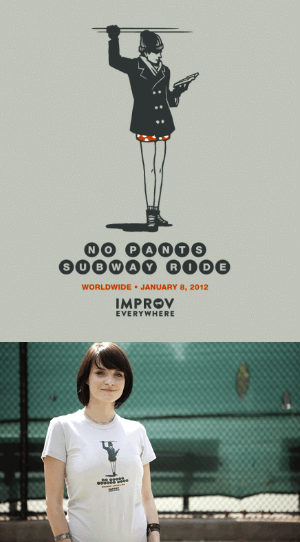
Some witty designs made for tshirts
I like the pictogram images of this design and the simple layout

Swearing Type


“Promote Swearing”

http://noquedanblogs.com/diseno/promote-swearing/

I thought this was quite humorous and an interesting way of playing with type

ImproveEverywhere

http://improveverywhere.com/2008/11/17


About Us

Improv Everywhere is a New York City-based prank collective that causes scenes of chaos and joy in public places. Created in August of 2001 by Charlie Todd, Improv Everywhere has executed over 100missions involving tens of thousands of undercover agents.

Improv Everywhere is, at its core, about having fun. We’re big believers in “organized fun”. Our missions are a fun source of entertainment for the participants, those who happen to see us live, and those watch our videos. We get satisfaction from coming up with an awesome idea and making it come to life. In the process we hopefully bring excitement to otherwise unexciting locales and give strangers a unique experience and a great story to tell. We’re out to prove that a prank doesn’t have to involve humiliation or embarrassment; it can simply be about making someone laugh, smile, or stop to notice the world around them.


This company is really innovative and creative and i love the mad light hearted ideas that are generally created to make the world happier.

Pen Prints

Prismacolor Pen Print

January 5th, 2009
“Prismacolor Pen Print” by Daniel Eatock. I can definitely recommend his book Imprint: Works 1975-2007.
A complete set of 156 Prismacolor Markers (arranged following manufacturer’s numbered color chart) held within inverted glasses, one ream of 25″ x 38″ uncoated, 40 lb. paper, divided into two stacks.
This work is adapted from Pantone Pen Print a 2006 edition of a total of 73 prints using a full set of Pantone markers.
Over the course of the 39 days of the exhibition (September 18 through October 26, 2008), the paper absorbed the ink from the pens. The sheets at the top of each stack absorbed more ink than the sheets farther away from the tips of the pens. The result is an edition of organically related prints, each unique.
The ink reached the 31st sheet in the stack of paper that comprises the top half of the diptych and the 29th sheet of the stack that comprises the bottom half of the diptych.Prior to discovering the extent of the edition, it was determined that the price of each diptych would equal the highest number of sheets stained by the ink.
Prismacolor Pen Print by Daniel Eatock


http://www.todayandtomorrow.net/2009/01/05/prismacolor-pen-print/
I thought this was a really cool idea and thought it might be worth experimenting with as visually it looks really intriguing

Very German


Concept and design for DAAD’s student competition. Playing with the idea of graphic design as an organising and structured discipline, and Germany’s reputation for organisation and efficiency, we invited participants to respond to the title ‘Very German’. We used a list of technical specifications to create a colour swatch of 837 wrong and 3 right ‘German flag colours’.

http://www.brightenthecorners.com/page.php?jumpTo=247#i247

I like the grid layout of this poster, visually i think its strong and an interesting take on the title 'very german'

CD Labelling Design


Bjork en Detalle

This is an idea by Joshua Distler which I thought was fantastic. He proposes to make a compact disc labeling concept, where each waveform accurately depicts a complete song in a 1-inch square. For now, I could only find Bjork’s album “Post” as an example, but I’m sure that everyone that’s familiar with these songs will agree on how fasinating and well done this idea is.
http://noquedanblogs.com/diseno/bjork-en-detalle/

I thought the layout and design of this was atheistically pleasing as its clear cut and simple but also the idea behind it  was also very clever.

Book Art

Biografías, created by artist Alicia Martín using 5000 books.


libros1
Thought was pretty cool 

Ice Cream Crayons


Originalidad Japonesa

Cera
Cera 1
http://noquedanblogs.com/inspiracion/originalidad-japonesa/

I just though these looked really cool and i like the way they've been packaged also

Packaging - Pit Stop

http://packaginguqam.blogspot.com/2009/05/pit-stop-cafe-homer-mandosa.html


PIT-STOP CAFÉ | HOMER MENDOZA

Pit-Stop café est un concept de transport pour café fait entièrement de carton recyclé. J'aime comment Homer dans mon cours d'emballage a exploré le potentiel de la matière kraft ondulée. Je pense que le concept parle de lui-même.Pit-Stop café is a simple transportation system for four coffees and anything that goes with it. It is conceived with post-consumer recycled board and out of one single sheet of paper. I think the images describe well the concept.

Monday 27 February 2012

Interview Redo

For our PPP task we had redo the interview sheet we filled out for getting into Leeds College of Art

From this we were paired up with partners, mine being Beth, and ask a series of questions to one another

Beths Answers

Our task is to now review each others blogs to source the answers from the interview within there work to create a double page spread along with our indesign workshops to demonstrate Beth as a person.

Sunday 19 February 2012

10 things i've learnt..

ABOUT MYSELF:


1. I break my phone often and can't cope well without it


2. Theres so much to learn out there - you can never no it all or to much and in order for me to find things i'm interested in, i need to go find them.
3. Love old, vintage looking textures/shades/type


4. I'm interested in subliminal things, things not so obvious to the eye and need thought


5. Simplicity is key in communication and i like it


6. Theres a lot left for me to learn and experiment in the use type


7. I'm not using graphics to its full potential and theres so much left undiscovered and untried


8. I continue to love paper craft and decorative things such as wrapping and decorations.


9. I work through my problems wether in work or personal life until i'm some what content

10. Tend to think about what the group think of my work, i should be more confident in what i design rather than question peoples opinions

ABOUT MYSELF PROFESSIONALLY:

1. Always feel i could do more and improve my work more, i never get a conclusion of happiness, always room to develop

2. I'm not afraid to admit i made a mistake or start again, even when everyone shouts my i'm crazy
3. I approach things differently to others and will always challenge myself with everything i can't make possible


4. Writing ideas down does help me and i should admit to myself that i won't remember them when i can't be bothered to

5. I love visual aspect of info graphics but aren't the best at figuring how to do it myself


6. I think of a lot of ideas and always want to do them


7. I've developed my skills on illustrator immensely which is probably a blessing

 
8. Visual aids really help in design ideas and development


9. Different packaging always intrigues me and is something i would love to work with


10. A sense of humour in graphic design is always appreciated