I wrote down the main factors i had got from going through Beth's blog so i could concentrate on these factors when drawing up some rough ideas.
Design ideas
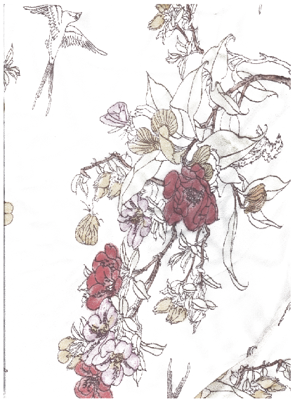
I scanned in some materials and floral patterns that i could consider working with.
Some possible letterforms
Live tracing experimentation
I like these floral letters and i think they'd suit Beth's dps well
On indesign i made the spread following the brief size guides and adding the 3 column grid i worked within my design ideas.
i decided to use this pattern for the page as i think it is most similar to Beths florals that she likes
I opened it in illustrator and live traced it so it was just lines and layered over a slightly coloured selection from photoshop
using photoshop i made the background translucent
and cropped out the part of the pattern i wanted making it full form on one edge so it didn't just crop to a line
Using one of the typefaces i had sourced previously i got my beginning letter for my text and filled it with the colours from the floral image to create a consistency in colour.
Placing both in the spread grid
i wanted to create different textures on my page and therefore used another floral fabric to create a silhouette of a girl
This fits the fairytale style and fits in with Beth's fondness of mixed media, florals and textiles.
Name
I played around with the colour scheme and the typefaces i favoured for her name
i love these put I'm not sure they are clear enough as letters
darker colours for the text
I'm not to fond of the pink text amongst the pink flowers, its to much so i tried sourcing a brown from the original flower pattern from the branch
This is better
Once i placed it in indesign i realised it could grouped together and become a bunch of flowers with text amongst it. The brown instantly made me think of a tree blossoming so i added branches in a darker colour to not intrude with the text. This didn't fit along the edge the page right so i added a tree trunk. This works better and fits the page well.
i didn't feel the name stood out enough and it looked a bit strange with all the blossom at the top of the tree so i played around on illustrator rearranging the text and rescaling. I also added some other bits of blossom so there weren't just big blobs on it and altered the colours to bring out the text more.
I want to print on handmade textured paper so i added that to the background to get a better view of what it'd look like.
I sent everything to the back which brought the texture though and added a little boy and girl kissing as as Beth said she likes romance.
i felt the second page wasn't quite right so thought about adding in a toadstool instead of the flowers at the bottom
i applied fabric images i had scanned on illustrator to the various shapes in the image using the clipping mask tool
i still didn't think this was right, the silhouette of the girl and boy didn't stand out enough so i tried moving them about
i tried changing them from the pattern to paper texture instead
then i experimented making them a different floral pattern
moving things forward and backward
then finally i added small shadow on the different images to lift them out the page slightly
i'm defiantly more happy with this but i feel there are still small things that need to change