30 Clever Examples of Negative Space Logos
Simplicity is the key to effective and memorable logo design. Creating a logo design you should consider less is more rule and make your logo as simple as possible and creative enough at the same time. Perfect technique to achieve this effect is to use negative space which can help you to achieve brilliant results. Negative space may be most evident when the space around a subject, and not the subject itself, forms an interesting or artistically relevant shape, and such space is occasionally used to artistic effect as the “real” subject of an image.
Negative space logos are becoming the next trend in all kind of industries. For that reason I’ve collected 30 clever logo designs with negative space used. Hopefully you will find this collection entertaining as well as inspiring.
Eagle Mountain Capital
Hairdresser
PROPANE INC
Jurassic Wine
Portrait Photos
Catch 5
SHIFT
5 LOCKS
VIA
Snake
Hafiz Bacote
VinoPiano
HE Logo
Fiska
Worldwide Short film Festival
Wine Quotations
MyShirt
Storm Foundry
Highly Decorated Bakery
Bird Home Press
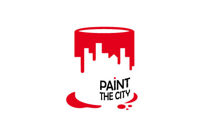
Paint the City
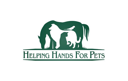
Helping Hands For Pets
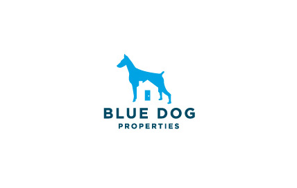
Blue Dog Properties
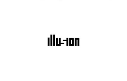
Illusion
Motion
Face to Face
HD LIVE
Circus of Magazines
Fork & Knife
Pelican
http://designwoop.com/2012/01/30-clever-examples-of-negative-space-logos/
















No comments:
Post a Comment