
As a mailout to promote myself I made 5 postcards one in each colour which I will send out to studios. It is a cheap and practical format in order to show myself and the bright colour will make them stand out as well as the die cut edge altering the format to make a new unique shape.


The reverse side has space to write a message as well as hold my details. I had to alter the font size slightly as it was to small and wouldn't be legible when printed.
I wanted to create another mailout which was text based so I played around with the whole 'hi' aspect of my initials.

I tried flipping letters upside down so that the concept was somehow involved and they understood that the initials flipped however it was difficult to portray.

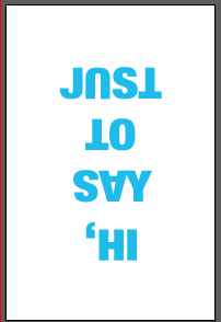
 This is how it would appear when they flipped to read the hi. It wasn't really working for me and defiantly didn't seem clear.
 I tried changing the phrase to lionel richies lyrics and having different weights in the fonts.
 I then altered the 'hello' to my flipped initials so it mirrored itself but this still wasn't working.
 I then thought of having my initials embossed into the white paper so when it asks is it me your looking for it has my initials and then on the reverse side when flipped over it says hi. Then using a name of someone in the business i'm mailing there is a direct message introducing myself and directing them to my website.
 I tired using all the colours of my branding but I felt that this took away the focus and made it look to busy.
 I then tried pairing the colours to bring out key parts of the body copy.


In the end I went with blue and pink to bring out the hello and the name of the person.

I wanted to create another mailout which was text based so I played around with the whole 'hi' aspect of my initials.
I tried flipping letters upside down so that the concept was somehow involved and they understood that the initials flipped however it was difficult to portray.


In the end I went with blue and pink to bring out the hello and the name of the person.

No comments:
Post a Comment